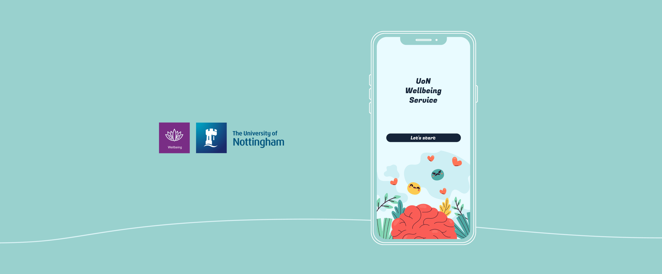
The app iteration provides students with easy access to mental health resources and support.
UoN Wellbeing Service App Iteration
Overview
University students increasingly face psychological challenges from academic pressure, interpersonal difficulties, and career uncertainties. Despite the widespread availability of mental health resources on campuses, student engagement with these services remains low. This study aims to design and develop a mental health application tailored for university students to enhance awareness and engagement with campus mental health services. I’ll be using University of Nottingham - Wellbing Service App as an example.
Project Duration
4 months (Jun-Sep, 2024)
Collaborator
Ringo Lin (Literature review, UI design,
User Interviews)
My Role
Conceptual Development / App User Experience
Tasks
Interview / Thematic analysis / Figma / User Testing
Research Background and Objectives
Our research addresses a key issue: low student engagement with campus mental health resources. To tackle this, we are redesigning the existing app using the Health Belief Model (Figure 1) and User Engagement Strategies. We aim to promote early intervention through customized communication and accessible design.
Ps. HBM emphasizes several key factors: perceived threat, perceived benefits, perceived barriers, and cues to action. We considered these factors in our design. As a specific example, our personalized notification feature demonstrates the application of HBM. Firstly, the notification content aims to increase users' perceived threat of mental health issues by providing information about the impact of stress on academic performance.

Figure 1. Health Belief Model (HBM)
The screenshot shows UoN's current health application. While the app provides basic service information, its content categorization is too general. Despite the school's abundance of mental health resources, the app uses overly broad categories (such as "I need support") without specifying the type of support available. This makes it difficult for students to quickly locate specific services they need, thus significantly reducing its usability (Figure 2). Therefore, we see room for improvement.

Figure 2. UoN original Wellbeing service App homepage
Research Questions
Question 1
Could app design significantly enhance students' awareness of campus mental health resources?
Question 2
Could personalised recommendations and user engagement strategies increase students' usage of these resources?
Question 3
Which factors in app design most influence students' long-term usage intentions?
Research Methodology
We adopted 3 main steps to develop and evaluate the application.
First, we analyzed existing products, ensuring the design was a user-centred design from the start.
1️⃣ Prototyping
2️⃣ Interviewee Recruitment & Qualitative Interviews
The interview participants were recruited through recommendations from friends, and we carefully selected them to ensure that the range includes those with and without experience in campus psychological counselling. We conducted qualitative interviews. These were semi-structured interviews comprising three phases: testing existing apps, testing my prototype, and finally, conducting user interviews.
We used thematic analysis and affinity mapping methods to organize the collected data.
3️⃣ Collecting User Feedback


Prototype Design
Preference Settings and Navigation Design
First, we included soft visual elements and empathetic text for the Landing Page design to deepen the emotional connection between students and the app. Regarding 'Preference Settings', there's a multi-step process:
1️⃣ Guide students to select options that best match their concerns, such as anxiety, depression, or stress management.
2️⃣ Allow students to set mental health goals, like emotional management, stress reduction, or improving interpersonal relationships.
3️⃣ Choose preferred content formats like articles, videos, interactive courses, or online counselling.
4️⃣ Set their desired participation frequency.
5️⃣ Select preferred notification methods, like email or app push notifications.


Quick Resource Card
Regarding the quick resource card, it covers five main sections, including links to campus mental resources:
"Emotion Management and Mental Health Support",
"Stress Management and Stress Relief",
"Relationship and Community Building",
"Crisis Support and Emergency Response"


Quick Help Setting
To further enhance the user experience, I implemented a 'Quick Help' button on the app's home screen. This feature incorporates the user's pre-set notifications and preferences and integrates a 'Quick Resource Access' function. This feature lets students directly click to enter relevant resource websites without navigating through complex menus.

Personalised notifications and recommendations
Finally, the App automatically sends personalized notifications based on students' preferences set during their initial setup. These notifications not only include the latest campus mental health information but also provide tailored supportive messages based on the student's mental status and personal needs. Through this personalized approach, I aim to increase students' long-term engagement with the application and provide ongoing support for their mental health.

Interview Result
FINDING 01
“The re-categorisation of mental health resources in the app prototype improves navigation and reduces confusion, addressing critical barriers to resource utilisation.”
P1: When the categories are unclear, and there's no intuitive navigation, it feels overwhelming and difficult to find what I need.


P3: The structure of resources was very confusing, and it took me too long to find what I was looking for.
📌 Concerning the first core research question—whether the app design can significantly enhance students' awareness of mental health resources.
FINDING 02
“Implementing the landing page provides students with a clear overview of available resources, potentially increasing their awareness and likelihood of engagement.”
P3: The landing page really helped me quickly find and understand the available mental health services.


P4: The landing page should be set to 'SKIP', after all, some people are anxious to enter the system directly.
📌 To the first core research question—whether the app design can significantly enhance students' awareness of mental health resources.
“Personalised notifications and preference settings meet individual needs, leading to more targeted and effective resource use.”
FINDING 03
P2: The app pushed the right resources to me, saving me time looking for what I needed.

P5: The custom notifications meant I was receiving information that mattered to me rather than general messages.

📌 In relation to the second core research question—whether personalised recommendations and user engagement strategies can increase resource usage.
FINDING 04
“The app’s quick resource search function addresses the need for immediate access to relevant information.”
P3: When I could not find the information quickly, it felt frustrating, and I almost gave up using the app.

P5: The quick access to resources is essential for me, especially when I need immediate support.
📌 Concerning the third core research question—identifying which design factors influence long-term usage intentions.
Future Prospects
Finally, based on the findings, I've identified key areas for future improvement.✨
• For those eager to use the resources, it may be necessary to set up SKIP navigation first.
• Designing landing pages tailored to different student types (e.g., new or international students) could enhance the app's adaptability and appeal.
• Encouraging students to set preferences can increase their control, autonomy, and willingness to use the app.