Rental E-scooters Smart Device CASE STUDY: Discover and Empathise
An innovative GPS navigation system for e-scooters, designed for urban commuters seeking a convenient, eco-friendly way to navigate cities.
Overview
Using a user-centred design approach, we redesigned an innovative GPS system for e-scooter riders. The process began with gathering user requirements through interviews and MoSCoW prioritisation to categorize key features. We developed low-fidelity prototypes, and non-user and user-based testing helped us identify usability issues and carried out iterations to improve the overall user experience.
Project Duration
4 months (Feb-May, 2024)
Team
1 Project Manager/2 UX Designer/2 UI Designer
My Role
UI/UX Designer (User research/Interaction & Visual Design/Prototyping/Usability Testing)
Tasks
Interview/Empathy Map/Service Blueprint/CoUA/MoSCoW/Prototyping/Usability Testing
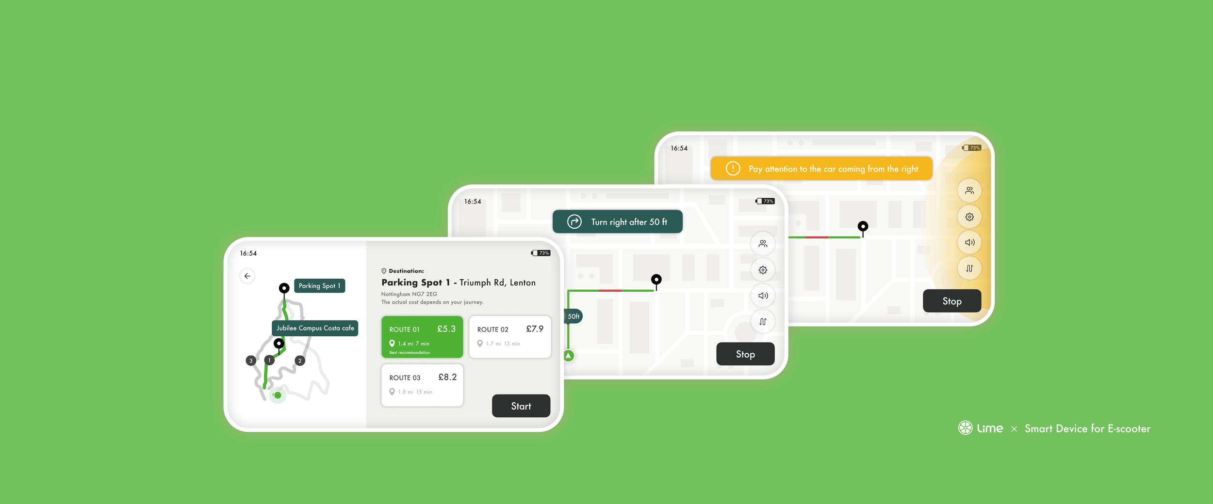
Final Solution: Main Scenarios
We design over 40 screens for the e-scooter’s device interface.
The interface on the right is the MVP screens.


Uneasy authentication
Unintuitive route planning
App’s navigation confusion
Complicated payments process
Failed to integrate other functions
Usability and Functionality Issues,
……
The main goal of the project was
to enhance user satisfaction and provide a more enjoyable and convenient alternative
to current e-scooter device dashboard options
Research Process
Discovery
User Interview
We identified the target group and interviewed 6 experienced and inexperienced respondents
We defined key interview questions, asking respondents to share their difficulties with using the GPS or riding the e-scooter
Interview Transcripts
Organise into key points
Empathy Map
We extracted key requirement phrases from the interview transcripts, following the five main domains
What does user think
What does user say
What does user do
What does user feel-pain
What does user feel-gain
We used Google Sheets to categorise and organise requirement phrases
CoUA
We used Context-of-Use Analysis to evaluate the tasks involved in riding an electric bike, considering key constraints.
In summary, these related to:
The system can add social features to boost user interaction and riding enthusiasm.
Providing essential information without overwhelming riders improves safety and usability.
Colour adjustments make the product more accessible, enhancing safety and the user experience.
A built-in robot on the interface can facilitate simple communication with users.
CoUA helped us identify additional user needs and ensure all factors were defined for future design
Service Blueprint
This helped us understand the user journey and identify key task workflows from a designer's perspective.
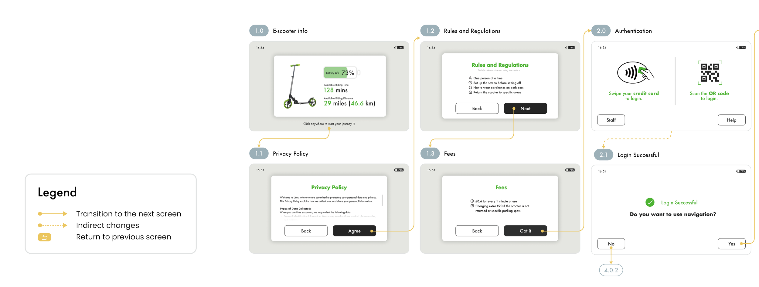
User Authentication Phase & Route Planning Phase
We found that there are three important logical judgements which may lead to different workflows depending on the user's choices:
Whether the user is a staff of the maintenance team
Whether the user has a mobile phone to interact with the e-scooter
Whether the user wants to rely on the functions of the e-scooter, such as navigation
Riding and Stoping off Phase & Payment and Parking Phase
The workflow is mainly divided by how the user wants to end the trip:
Temporary parking
Spontaneously ending the trip
Passive ending guided by the system when arriving
Other general settings and functions are also independent of the stage, such as group trips and system settings.
Market Research
We reviewed UK e-scooter trial data (2022) for our device screen design.
Over 50% use e-scooters for leisure, suggesting the need for entertainment features.
Common concerns such as safety and unfamiliarity guided our focus on addressing these issues.
Inexperienced users value fun, while experienced users prioritise speed and convenience, emphasising the need for an efficient screen.
After gathering user needs, it is essential to prioritise them. Focusing on the most critical needs will enhance product satisfaction
MoSCoW — Needs Priority
We classify requirements into four categories including:
Must have (M)
Should have (S)
Could have (C)
Would not have (W)
We use “MoSCoW” in Figma jam to categorise requirements
User Flow & Sketch
The team brainstormed design ideas based on the user journey and requirements, then sketched them out and digitised them in FigJam to create low-fidelity prototypes.
Lo fi wireframe: Initial idea
We created several interfaces for the device to meet our derived URs, including:
General settings
User Identity Confirmation — Welcome Process | User Login | Maintenance situations
Route Planning — Searching for the destination (include 3 ways) | Adding a stop during planning | Choosing a preferred route
Riding with Navigation — Navigation interface | Temporary parking | Ending the trip
Payments
Group Trips Scenario
To further enhance the user experience,
we did the usability testing
With the Lo-fi prototype, we aim to assess usability using user—and non-user-based testing methods, including collecting feedback on overall user satisfaction and a First-Click Test.
What users feel about the interfaces...
🧑🏽🦱
👱🏻♂️
👱🏻♀️
👧🏻
👩🏻🦰
👩🏼🦱
We organised the feedback we collected into a shared document in Figma Jam.
In the first-click test, we recorded and analysed users' initial clicks to assess the system's effectiveness
The overall correct action rate ranges from 50% to 75%.
The "Route Planning - Stops" feature had the lowest success rate (20%), suggesting confusion or lack of clarity in the interface regarding route stops.
The "Route Planning - Routes" feature also showed a low success rate (40%), implying that the routing function needs to be more intuitive or prominent in the interface.
The "Change Destination" feature also had a low success rate (40%), indicating that the option or method to change the destination may not be immediately obvious to users.
To solve the above issues, we decided to iterate to deliver a more satisfying user experience.
Iterations
According to the feedback from users and non-user tests, we gained helpful feedback and then iterated the design based on it. Here are some important design improvements.
Privacy Policy and Regulations
Route Planning
Navigation
Riding and stopovers
Ending the trip
Payment
Reflection
💬 Looking Back
Reflecting on the design process, we've gained valuable insights into the user-centred design approach. This journey emphasised creating functional solutions aligned with user needs and expectations. Through extensive user research, gathering requirements, and prioritising key features, we designed and tested prototypes to address real pain points. Continuous iterations focused on improving usability, aiming to provide a navigation tool that is efficient, intuitive, and enjoyable. This process has reinforced the crucial role of user feedback in enhancing the e-scooter riding experience.
💬 Looking Forward
Some features that may be considered in future prototypes, such as novice interface guidance, emotional design that encourages use, and integration with urban transportation systems, are also not included in the current version. This is based on the intuitiveness of product interactions and the consideration of keeping the design simple and consistent with regular usage habits. We also consider integration costs, data storage needs, commercial negotiations, government cooperation, etc.


